홈 HOT 문화 푸드 여행 스포츠 라이프 건강 실버 뷰티 패션 경제 게임 IT 부동산

서비스 정보

사이트 소개 문의하기 이용약관 개인정보처리방침 청소년보호정책

검버섯 연고라고 무턱대고 바르지 마세요…피부 손상 위험 주의

핵심 요약

  • 집에서 검버섯을 제거하려는 시중 연고, 빙초산, 마늘즙은 위험합니다.
  • 이 방법들은 노화 피부에 화학적 화상과 영구 흉터를 남길 수 있습니다.
  • 검버섯처럼 보여도 다른 피부질환이나 피부암일 수 있어 진단이 필요합니다.
  • 피부과에서는 레이저나 냉동치료로 병변 깊이에 맞춰 안전하게 제거합니다.
  • 갑자기 커지거나 색·경계가 변하면 자가 제거 대신 피부과 진료를 받으세요.

Create a high-quality image for a blog article.
Description: 60대 시니어가 욕실 거울 앞에서 비타민 C 세럼을 손바닥에 덜어 얼굴에 바르고 있는 저녁 실내 장면, 차분한 조명
Style: modern and clean photography
Requirements:
- Photorealistic or high-quality illustration
- No text overlays (if text is needed, use large bold sans-serif fonts)
- Professional quality suitable for blog content
- Visually appealing and relevant to the description
- If any Korean text appears, it must be properly composed and OCR-readable
- NO broken, distorted, or illegible characters

Additional requirements:
[STYLE] Realistic documentary / photojournalism. Natural daylight or soft indoor light, candid, authentic. Real Korean subjects, natural skin texture, shallow depth of field with natural bokeh. No beauty filter, studio strobes, or cinematic grading. Present-day Korea (2026): modern interiors, current clothing, up-to-date devices; no film grain or dated color cast. Keep it clean and comfortable to view — natural, not gritty. Show a condition the article is actually about (rash, wound, post-exercise sweat, skin problem) only when it is the topic, and then mild and non-graphic — never raw, gory, or repulsive. Otherwise keep skin healthy and clothing, bags, shoes clean and tidy. Exception: if the article is explicitly about the past or an earlier era, match that period.

[PRIORITY] On conflict, order: (1) article accuracy and logic; (2) subject age, identity, continuity, medical/location accuracy; (3) documentary realism; (4) text avoidance, object clarity, physical correctness; (5) differentiation across the set; (6) styling and color variety. Never sacrifice accuracy, identity continuity, or narrative logic for variety, color, or drama.

[SAFE DEFAULT] Keep scenes simple and clean: a plain setting, a calm subject or still life, uncluttered background, few objects. If any detail is uncertain or hard to render, simplify, crop, obscure, or omit it — never invent or force it; a clean believable image beats an ambitious flawed one. Actively avoid setups AI renders poorly: many identical labeled items facing the camera (store shelves, fridge cases, book spines, parked cars, signage walls); scenes that only work if text is read (receipts, prescriptions, screens, schedules, charts); precise tool-in-hand actions in close-up (injections, blood draws, stitching, cotton swab in the ear); and exact real-world specifics (named landmarks, brand logos, maps, currency). When a topic seems to need one of these, convey it indirectly — through a person's gesture and expression, a single item with text hidden, or the moment just before/after the precise action — keeping any such element minimal and out of focus. Prefer visually unmistakable action over scenes that need text to be understood.

[SET] One coherent image set for a single article (body images + one thumbnail), same style and topic, each visibly different. Thumbnail follows the same photo rules — never illustration. Treat each article as new casting: fresh, distinct people, not a default face or those used in other articles. Variety must never override identity, location, wardrobe, or logical continuity when the same person, place, or same-day event continues.

[CASTING] Derive the person from the article body, not a default: read who it is about (cases, examples, symptoms, scenarios) and cast their gender, age, situation. If the body implies a specific person (man in his 60s, mother of a toddler, office worker), depict that person. If unspecified, choose deliberately and cast men as often as women — never default to female across unrelated articles. Age must match the topic, including thumbnail and relevant background figures: pediatric → children + caregivers; adolescent → teens; young-adult → 20s; working-age → 30s–50s; senior → 60s–80s (no young adults/children as main focus). For general health/lifestyle not senior-targeted, default to 20s–30s (teens or 40s–50s when the topic calls for it); do not default to elderly for non-senior topics; reserve 60s–80s for senior or age-related topics. Never make an elderly subject look youthful or a senior topic look young. Within the required age, pick a distinct look, e.g.: lean, long narrow face, sharp cheekbones / stocky, broad jaw, thick brows / round soft face, full cheeks, slight stoop / tall angular, high forehead, swept-back hair / small slight, fine features, thick glasses / heavyset, wide face, cropped hair / fair complexion, low tied-back bun / thinning or balding, black-rimmed glasses / square face, strong jaw, deep-set eyes / compact muscular, thick neck, close-cropped hair. Vary hair (cropped, parted, tied back, permed, thinning, black, dark brown, dyed, salt-and-pepper, gray, white), skin tone, build, posture, glasses — matched to the age. When the same person recurs in one article, keep the same facial structure, age, hairstyle, hairline, glasses, build — do not recast between scenes. Back views, over-shoulder, hands-only, or people-free framing are valid when the topic allows.

[SUBJECT] People and real situations are usually the main subject — never a product as an advertising hero. When the article is about a place, food, object, ingredient, or phenomenon, a people-free scene (landscape, room, dish, ingredient, object in use) is fully valid; choose what the article calls for. Predominantly Korean (East Asian). The scene reads at a glance through the situation itself (problem, consultation, exam, treatment, recovery, comparison, decision, daily life). Candid gaze, natural body language, absorbed in the situation, not posing or staring at the camera. Match emotion to the stage — mild concern for a problem, thoughtful for a choice, focused in consultation, calm relief in recovery/daily life — never a default worried face, theatrical despair, or advertising smile. Use the fewest people needed; no background crowds unless the setting requires them.

[THUMBNAIL] Same realistic-photo rules — never illustration. Tighter crop on one face/expression, one clear action, or a single unmistakable situation, readable in under a second. Pure photograph edge to edge, with no generated title, caption, lettering, or graphic text anywhere — especially none across the top. Do not reserve a "title area" or add any box, banner, bar, overlay, placeholder, rectangle, or flat shape; empty space is just ordinary photographed background (wall, sky, furniture, soft bokeh). Do not fabricate blank panels to satisfy the no-text rule; get clean framing via angle, crop, depth of field, subject placement. Keep clothing prints, signs, and background lettering out of focus or out of frame. Thumbnail age and situation must match the topic.

[WARDROBE] Current season is summer (change this word as seasons change); dress for that season's real Korean weather (summer = light short sleeves, breathable fabrics, no heavy jackets; winter = knit, coats, padding; spring/autumn = light layers). If the body implies a specific season, setting, or activity (winter topic, exercise, sleep, bathing, hospital, outdoor work), let that decide instead. Ordinary age-appropriate Korean wear or authentic uniforms; no prints, slogans, logos, or brand tags. In a same-day continuous sequence, continuity wins: keep the person's clothing consistent unless the narrative requires a change. For color, actively lead with warm/earthy families — terracotta, mustard, olive, forest green, burgundy, warm brown, cream, rust, dusty rose, deep teal — varying hue, brightness, saturation, fabric, silhouette across the set. Cool blue, navy, beige, white, gray may appear occasionally but must not become automatic or dominate; do not dress unrelated people in the same/similar color, and never use medical-looking pale blue just because the topic is health. Keep colors realistic and age-appropriate. Exception: genuine uniforms (scrubs, caregiver wear, lab coats, school uniforms, workwear) may share colors and styles — do not force variation on them.

[LOCATION] Pick the setting from the article's context and vary it across topics — home, clinic, hospital, pharmacy, street, park, market, workplace, school, restaurant, community center, transit — not always a living room or hospital. Believable present-day Korean environments with fitting architecture, furniture, props; no generic AI studio rooms or showroom-perfect interiors; lived-in but clean enough for editorial. For a named real place, match its real architecture, terrain, layout, and features; never invent, stylize, or substitute a fictional version. If uncertain, use a plain non-identifiable setting rather than a confidently wrong one.

[SCENE & REALNESS] Landscapes, interiors, food, ingredients, objects may stand alone when the article is about them. Depict only real, plausible things as they normally look — real Korean places, dishes, ingredients, everyday objects with correct proportions, materials, and relationships. No fictional or fantastical substitutes: no imaginary landmarks, made-up food, impossible devices, surreal objects, fictional signage. If a specific real item is named, match its genuine look; if it can't be shown accurately, use a plain generic version, not a wrong or invented one.

[OBJECT & COMPOSITION] Compose like real editorial photography, not staged demos, ads, or AI catalog shots. Avoid perfect symmetry, default-centered subjects, and objects lined up toward the lens; allow natural overlap, partial cropping, foreground/background depth, slight asymmetry, ordinary placement. Keep one primary subject/action, few supporting elements, a believable background. Packaged items (milk/soy-milk cartons, medicine boxes, cosmetics, supplements, household goods) must look like real, ordinary Korean products with normal packaging design — realistic shape, cap, colors, simple graphic blocks — never blank white packaging and never covered in generated lettering; any fine print reads as soft, unfocused texture, not spelled-out words. Hide specifically the brand-name area (a hand holding the item, a slight side angle, an edge crop) while the product stays clearly identifiable by shape, color, and design — a viewer recognizes "that's a milk carton / a medicine box" at a glance with no readable brand name. Prefer hand-held or side-angle compositions that naturally hide the name, and keep any product minimal — one or two items, not a filled shelf or fridge. Distinguish similar items (milk vs soy milk) by color, design, and context (contents, vessel, the person's action), not readable labels; serving food or drink in bowls, cups, or plates is also fine.

[PEOPLE] Groups/family scenes mix ages, genders, faces, body types when appropriate; don't add people to fill the frame. Medical scenes use plausible settings, equipment, uniforms, positioning, gestures. Medical imaging (x-ray, scan, ultrasound, chart) must match the body part discussed — hand article → hand/wrist, knee article → knee, never an unrelated part. If uncertain or non-essential, keep imaging out of frame or out of focus. No unnecessary IV bags, injections, surgical gear, monitors, or dramatic props for medical effect.

[TEXT CONTROL] Avoid generating visible text; it should never be needed to understand the image. Do not fake, scramble, smear, or distort lettering — that produces garbled pseudo-text; remove text through composition instead (out of frame, turned away, cropped, blocked, or in soft background bokeh). When a text-bearing surface would exist (sign, screen, book, newspaper, menu, document, receipt, ID badge, clock, license plate, form), keep its printed face hidden this way. No prominent or readable brand names, logos, promotional wording, publication titles, employee/clinic names, room numbers, plates, medicine instructions, or forms; unavoidable incidental text stays tiny, distant, out of focus — never fake lettering. Packaging is the deliberate exception (see OBJECT & COMPOSITION): keep a realistic printed look and hide only the brand name, never a blank white package or sharp fake words. Devices (phone, laptop, tablet, TV, monitor) physically correct: a display only on the real screen side; rear, edges, casing have no screen, image, or glow; never a display on a non-screen surface; prefer user-side, screen dark/off, or angled away when content isn't essential.

[ANATOMY & OBJECT REALISM] Natural, physically plausible anatomy — correct limbs, joints, hands, fingers, facial structure, proportions. Simple relaxed poses and ordinary interactions; if a hand pose gets complex, simplify it (on a lap or table, loosely holding one object, partly out of frame, or obscured). No unnecessary multi-object hand interactions. Faces intact and natural (back, side, partial views allowed), never faceless, melted, or distorted; background people plausible too. Objects must also obey real-world scale, count, and structure: everyday items keep normal proportions (a cotton swab is short, a spoon spoon-sized), correct number (one swab in one hand — not two, not one in each hand), and complete structure (a refrigerator has doors, a mug one handle, a chair four legs). Show tools used the normal way a real person would; do not invent extra parts, missing parts, fused objects, impossible sizes, or duplicated tools. For a small precise action (cotton swab to the ear, tweezers, thermometer), keep one correctly sized tool, in one hand, in a simple natural pose, ideally at a slightly pulled-back angle rather than an extreme close-up.

[DIFFERENTIATION] Each image (including thumbnail) visibly distinct without breaking continuity. Differentiate via two or three of: shot distance, angle, action, pose, gaze, subject placement, background, depth of field, story stage, or wardrobe palette when a change is allowed. For independent or different-day images, wardrobe color aids differentiation — avoid the same dominant hue in consecutive independent images (not applied to same-day scenes or genuine uniforms). Use a range of shots: a wide environmental shot when setting matters, a medium action shot, a close detail or expression — not every image a waist-up medium portrait. At least one image may avoid centering a face (hands, back view, over-shoulder, object-in-use, environment). Mix front, side, back, three-quarter, over-shoulder views. Never change identity, clothing, or environment of a continuous same-day scene just for variety.

[NEGATIVE] illustration, clipart, cartoon, vector, flat design, infographic, 3D render, anime, drawing, painting, garbled or fake text, readable text, title/header lettering, text across thumbnail top, readable signs, readable brand name, spelled-out product name, garbled lettering on packaging, blank white or unlabeled packaging, store shelf full of products, fridge case full of cartons, rows of packaged products, wall of labeled packages, packed retail shelf, logos, publication titles, name badges, IDs, captions, watermarks, advertisement look, promotional poster, product hero shot, product-catalog framing, packages lined up toward camera, graphic title box, blank title panel, banner, overlay panel, solid color block, flat shape over photo, mismatched or wrong-body-part x-ray, anatomically inconsistent medical image, incorrect medical equipment, implausible medical pose, unnecessary dramatic medical props, screen on device back, display on non-screen surface, double-sided screen, fictional or inaccurate real place, fake landmark, wrong architecture, made-up food, impossible object, distorted proportions, oversized everyday object, wrongly scaled tool, elongated cotton swab, duplicate tool, two tools for a one-tool action, one tool in each hand, missing refrigerator door, missing or extra object parts, fused objects, structurally impossible object, malformed everyday item, posed stock-photo aesthetic, empty white studio, perfect symmetry, objects lined up toward camera, malformed anatomy, extra or missing limbs, malformed hands, extra fingers, three or six fingers, fused fingers, distorted or faceless face, severe facial asymmetry, crossed eyes, cloned or duplicated people, beauty filter, plastic or waxy skin, overly hyperreal, raw gory detail, bloody wound, graphic injury, oozing sore, repulsive close-up, filthy stained clothing, grimy shoes, grungy look, studio strobe, advertising smile, theatrical despair, posed expression, staring at camera, unnecessary crowd, wrong-era anachronism, dated color cast, film grain, vintage tone, out-of-season clothing, winter clothes in summer, elderly as default for non-senior topics, repeated dominant wardrobe color across unrelated images, everyone in the same or similar color, medical pale-blue as default civilian wear, recurring default face across articles, recast person between continuous scenes, non-Korean dominant cast when Korean required, age mismatch, youthful elderly, near-duplicate composition, repeated pose or angle, monotonous framing

## [PERSON APPEARANCE VARIATION — apply ONLY if this image includes people]
If people appear in this image, the main person must be a Korean woman in her 50s with these exact features: round face, hooded eyes, angular eyebrows, rounded nose tip, prominent brow bone, ears visible, pixie cut, slightly tanned skin, wearing thin metal glasses, a slightly troubled thoughtful look, petite build.
Wearing: beige linen shirt (adjust to season/context of the article).
Composition: eye-level medium shot.
These appearance details OVERRIDE any other demographic guidance in this prompt.
If this image does not naturally include people, ignore this section entirely.

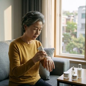
검버섯이 늘어나는 것을 보며 시중 점 제거 연고나 빙초산, 마늘즙으로 집에서 없애려는 분들이 많다. 하지만 이런 방법은 검증되지 않은 데다 노화로 얇아진 피부에 화학적 화상과 영구 흉터를 남길 수 있어 위험하다. 검버섯처럼 보이는 병변도 다른 피부질환이나 드물게 피부암과 구별해야 하므로 갑자기 커지거나 색·경계가 변하면 자가 제거 대신 피부과 진단부터 받아야 한다.

Q. 점 빼는 연고나 크림으로 집에서 검버섯을 없앨 수 있나요?

완전히 제거하기 어렵고 부작용 위험도 있다. 검버섯은 표피가 두꺼워져 돌출된 병변이라 일반 크림만으로는 깊이 있는 제거가 힘들다. 성분이 불명확한 제품은 피부에 염증을 일으키거나 색소침착을 남길 수 있고, 제거 후에도 병변 경계가 그대로 남아 결과가 만족스럽지 않을 수 있다. 검버섯인지 다른 병변인지 확인 없이 크림을 반복 사용하면 진단이 늦어질 수 있다.

[점 제거 연고 사용 전 확인 기준]

  • 성분·식약처 허가 여부 표시
  • 사용 후 붉어짐·따가움 반복 여부
  • 병변 색·크기 변화 관찰 기록

→ 2주 이상 사용해도 변화가 없거나 자극이 반복되면 사용 중단 후 피부과 상담

Q. 빙초산이나 마늘즙은 왜 위험한가요?

강한 산과 자극 성분이 정상 피부까지 손상시킨다. 빙초산은 화학적 화상을 일으켜 피부가 움푹 패이고 색소침착이 남을 수 있으며, 눈에 들어가면 심각한 손상을 초래한다. 마늘즙은 마늘의 자극 성분이 피부에 화학 화상처럼 작용해 붉어짐, 부종, 염증을 유발한다. 노화로 진피층이 얇아진 상태에서 민간요법을 사용하면 깊은 층까지 손상돼 괴사와 영구 흉터로 이어질 수 있다.

[민간요법 사용 시 나타나는 위험 신호]

광고
  • 바른 부위 붉어짐·따가움 지속
  • 피부 표면 하얗게 변하거나 진물
  • 병변 주변까지 넓게 손상 범위 확대

→ 위 신호 중 하나라도 나타나면 즉시 사용 중단하고 흐르는 물로 씻은 뒤 피부과 방문

Q. 검버섯은 어떻게 진단하고 치료하나요?

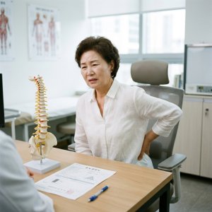
피부과에서 육안·확대경 검사로 검버섯인지 다른 병변인지 구별한 뒤 병변 깊이에 맞는 치료를 진행한다. 검버섯으로 확인되면 엔디야그 레이저, 어븀야그 레이저, 냉동치료 등으로 병변을 제거할 수 있다. 레이저는 병변 깊이와 색소 밀도에 따라 회수와 강도를 조절하며, 냉동치료는 액체질소로 병변을 얼려 떨어뜨린다. 치료 후에는 색소침착 예방을 위해 자외선 차단과 보습 관리를 이어간다.

[피부과 방문 전 준비 항목]

  • 병변 발생 시기·크기 변화 기록
  • 피가 나거나 딱지 생긴 적 있는지 메모
  • 복용 중인 약·기저질환 목록

→ 위 정보를 정리해 가면 진단과 치료 계획을 정하는 데 도움이 된다

Q. 검버섯을 그냥 두면 문제가 생기나요?

대부분은 양성 병변이지만 갑자기 변화가 생기면 확인이 필요하다. 검버섯은 나이가 들면서 자연스럽게 생기는 양성 피부 병변이고 건강에 직접적인 해를 주지 않는다. 하지만 검버섯처럼 보여도 다른 피부질환이거나 드물게 피부암과 구별해야 하는 경우가 있어 병변이 갑자기 커지거나 색·경계가 변하고 피가 나거나 딱지가 반복되면 방치하지 말고 피부과 진단을 받아야 한다.

[검버섯 관찰 시 피부과 상담 기준]

  • 6개월 이내 크기 2배 이상 증가
  • 병변 색이 불규칙하게 진해지거나 번짐
  • 피가 나고 딱지가 떨어지는 일 반복

→ 위 기준 중 하나라도 해당하면 자가 제거 대신 피부과에서 조직검사 여부 확인

검버섯 제거는 병원 방문이 번거롭고 비용이 부담되더라도 자가 제거보다 피부과 진단과 치료가 훨씬 안전하다. 민간요법으로 생긴 화상과 흉터는 되돌리기 어렵고 치료 비용도 더 커질 수 있으므로, 병변이 신경 쓰인다면 피부과에서 병변 종류를 먼저 확인한 뒤 레이저나 냉동치료처럼 깊이에 맞는 방법을 선택하는 것이 가장 확실하다.
Trending Now
@keyframes hw-spin { to { transform: rotate(360deg); } }